https://www.reviewjournal.com/sports/go ... rs-colors/" onclick="window.open(this.href);return false;
From a distance, it looks like a pair of red dashes.
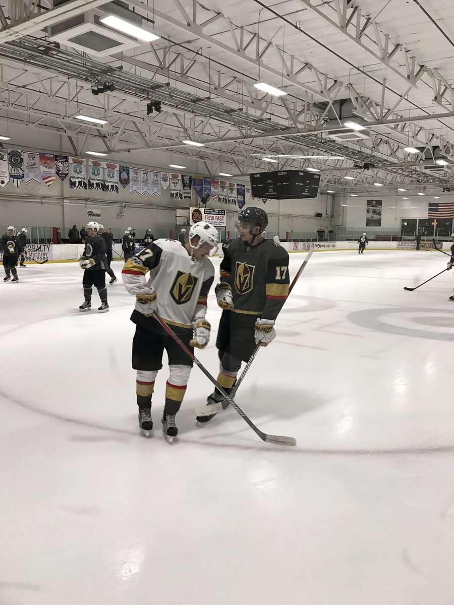
Vegas Uniforms
-
CT Mechanic
- ECHL'er

- Posts: 515
- Joined: Wed Feb 08, 2006 8:02 am
- Location: Vegas, baby. Vegas.
-
no name
- AHL Hall of Famer

- Posts: 8,324
- Joined: Fri Feb 09, 2007 3:19 pm
Re: Vegas Uniforms
What is up with the white gloves???
-
ville5
- NHL Healthy Scratch

- Posts: 10,358
- Joined: Mon Jan 30, 2006 1:17 pm
- Location: getting body slammed by kelly kelly
Re: Vegas Uniforms
They'd be alright if it wasn't for the hideous yellow and red stripes on the sleeves.
-
Admin
- Site Admin
- Posts: 13,300
- Joined: Sat Jan 28, 2006 12:04 am
Re: Vegas Uniforms
ville5 wrote:They'd be alright if it wasn't for the hideous yellow and red stripes on the sleeves.
-
interstorm
- ECHL'er
- Posts: 1,179
- Joined: Tue Sep 12, 2006 5:53 pm
- Location: From IglooReport - same user name
Re: Vegas Uniforms
Everything about the name and the logo is AWFUL.
Inspiration is drawn from West Point and its importance to the owner. Well -- that's nice but how about they actually name something after the city itself (either that or rename the team by dropping "Vegas" to something like "Foley's Golden Knights"). West Point is in New York on the other side of the country. The nickname should be a something that resonates with the area and something that the fan base naturally identifies with (for this same reason I hate the "Predators" as Nashville's name. Who cares about a skeleton of a big toothed cat found decades earlier when the city is known worldwide for it's musical influence).
Then there are the colors -- and the horrible/weird sparkly golden arm bands. Vegas knows they're support to make a jersey that people want to buy and wear, right? I wouldn't put that thing on if I was suffering from hypothermia! The white gloves with the grey uni's look like an afterthought -- as if the equipment manager totally forgot about them and had the team bus stop at Play It Again Sports on the way to the game. I'm 'meh' on the grey overall too -- it goes well with red and, I guess, gold (if one insists on having gold -- which I assume is necessary because of "Golden" in the name. Someday someone will buy this team and as the ink is drying on the check that'll be the first thing they drop (remember the "Mighty" Ducks? Yeah -- that was a bad idea too)).
While not very original they should have went with something like the "Rollers" or the "Aces" or something that makes sense. That grey would look a lot better if the gold was gone and they amped up the red (grey/red/black). Those would be Sin City colors for sure...
-
Lesky
- AHL'er

- Posts: 3,153
- Joined: Fri Feb 03, 2006 4:56 am
- Location: Iceoplex
-
Sigwolf
- AHL'er
- Posts: 3,320
- Joined: Sat Jan 28, 2006 12:10 pm
- Location: north central Ohio
Re: Vegas Uniforms
That is one ECHL-looking uniform...
-
no name
- AHL Hall of Famer
- Posts: 8,324
- Joined: Fri Feb 09, 2007 3:19 pm
Re: Vegas Uniforms
Super lame uniform.
I agree with everything interstorm said. To lazy to quote it. I would of taken a page from Arizona name and went with Nevada in stead of their city. Makes sense if you know you will be the only hockey team from that area might as well try and have the state support the entire team. I got no problem that Vegas got the team, I just hope its a healthy, stable franchise.
Could of gotten a better color scheme.
-
Sigwolf
- AHL'er
- Posts: 3,320
- Joined: Sat Jan 28, 2006 12:10 pm
- Location: north central Ohio
Re: Vegas Uniforms
The funniest thing about the Vegas franchise, apart from their minor league uniforms, is their below minor league GM. George McPhee should have never been involved in the NHL. He drove the Capitals into the dirt, and every move he has made with a new team proves he is just as stupid. This guy is literally a hockey moron. I see that grinning **** and I am literally left speechless...
-
Jim
- NHL Fourth Liner

- Posts: 19,148
- Joined: Tue Jan 31, 2006 9:18 pm
- Location: Pittsburgh
Re: Vegas Uniforms
Most hockey uniforms look... goofy or childish. Even (especially) the classic ones, hello Montreal.
-
sluggermatt15
- Junior 'A'

- Posts: 338
- Joined: Sun Mar 20, 2011 7:45 pm
Re: Vegas Uniforms
I agree with Interstorm, he hit the nail on the head. The naming, uniforms, everything about the Vegas franchise doesn't make sense. Though I do think the white jersey looks superior than the gray. IMO black or red should've been the primary color. Not gray. Yuck.
-
no name
- AHL Hall of Famer
- Posts: 8,324
- Joined: Fri Feb 09, 2007 3:19 pm
Re: Vegas Uniforms
The uniforms are really growing on me. Still same old complaints. The red band WHY?!?!?!? the gold would of been better if it was a solid kind of gold, not a sparkly kind.
-
DelPen
- NHL First Liner

- Posts: 61,584
- Joined: Sat Jan 28, 2006 8:27 am
- Location: Lake Wylie, SC
Re: Vegas Uniforms
Hey look much better in person and at last they are a bit different. Glad we finally got rid of the Khaki gold and back to Champion Gold.